Showing posts with label Federal Reserve. Show all posts

Thursday, October 16, 2014

New Non-Profit Takes On The Federal Reserve

Seth Mason Charleston SC blog 1Update  01/10/15: Because I've ceased publishing ECOMINOES, I've removed a great many articles I believe have become less relevant over time. I've deleted as many links that were broken as I could find...I apologize if I missed any. Also, due to the proliferation of spam, I've closed comments and deleted the ECOMINOES Facebook page and Twitter account.

It's been a pleasure promoting economic and individual liberty here on ECOMINOES. Now, I'm taking my passion to the next level by launching Solidus.Center, a 501(c)(3) non-profit that promotes economic strength and stability, sound money, equality of opportunity, and reduced government debt by limiting the Federal Reserve System’s influence on the American economy.

The following is a brief video explaining this new venture:


Solidus.Center is currently in the start-up phase, and we're looking for help. If you or anyone you know might be interested in board, fellowship, or volunteer opportunities, please contact me at seth@solidus.center.

Thank you so much for following ECOMINOES! I hope you'll join me on the next level.

Seth Mason, Charleston SC

Saturday, July 19, 2014

America's Undiagnosed Economic Cancer

Seth Mason Charleston SC blog 2
Since the 1990s, the Federal Reserve and Washington--under their respective contemporary leadership--have been veritable tumors on the U.S. corpus economicus. The chemical marriage between our nation's central bank and central government has been--undoubtedly--the primary cause of our precipitous and painful decade-and-a-half economic decline. Tragically, the majority of Americans don't understand our economy's chronic disease.

The Undiagnosed Disease

In the 1990s, the Federal Reserve and the federal government--of which Republicans and Democrats shared control--made concurrent terribly-ill-advised policy changes that precipitated the disastrous bubble-bust paradigm that's been disintegrating our economy over the last 15 years.

That decade, the Fed, led by Alan Greenspan, began the modern Fed tradition of pumping liquidity for long periods of time in the wake of recessions. At the same time, the federal government, whose Legislative Branch was controlled by Republicans and whose Executive Branch was controlled by Democrats, passed the Gramm-Leach-Bliley Act, which repealed Glass-Steagall, a law created in the wake of the Great Depression that prohibited deposit banks from "investing" (read: playing with) depositors' money. (Indeed, there are many similarities between the modern Fed and federal government and those of the years preceding--and during--the Depression.) Armed with cheap capital pumped by the Fed and a carte blanche to throw around other peoples' government-insured money, investors went wild, dumping buckets of Dollars into over-valued tech companies and preposterous dot-coms, multiplying their foolish, nearly-risk-free bets hundreds of times over through a derivatives market that had been recently deregulated by said bipartisan-controlled federal government. Not surprisingly, the tech bubble eventually burst, the financial system crashed, and the American economy began to feel the symptoms of its new economic cancer.

During the early 2000s recession, the Fed and federal government attempted to reinvigorate the economy by inflating another bubble, the housing bubble. Greenspan's Fed once again kept interest rates dangerously low to promote borrowing, even though inflation was becoming problematic. By summer 2008, the median price of a gallon of gas in this country had risen to--in 2014 dollars--$4.70, a 400% increase in 10 years! The price only returned to earth when the economy crashed.

Also in the 2000s, the Fed began vigorously enforcing the Community Reinvestment Act, a passable 1970s law made draconian in the 1990s through legislation passed by--once again--the Republican-controlled Congress and signed by the Democrat-controlled White House. The new incarnation of the CRA forced lending institutions to accommodate sub-prime borrowers, a move that was supposed to stimulate the housing market and create equity for the poor. Instead, the CRA created a proliferation of so-called "toxic" mortgages that found their way into investors' portfolios due to legislation sponsored by Democrats Barney Frank and Chris Dodd--and passed by the Republican-controlled Congress and White House--that reduced the mortgage-buying standards of Government Sponsored Enterprises Fannie Mae and Freddie Mac.

With their standards watered-down, Fannie and Freddie began repackaging toxic mortgages as toxic investment vehicles and selling them to institutional investors, who gladly snatched them up with their cheap, nearly-risk-free capital pumped by the Fed and backed by the federal government. (Sound familiar?) Once again, institutional investors multiplied their foolhardy bets hundreds of times over through the newly-deregulated derivative market. Eventually, the housing bubble, the largest asset bubble in the history of the United States (so far), led to the greatest economic collapse the U.S. had suffered since the Great Depression, a collapse whose aftermath is still apparent in the job market 6 years later.

The Overlooked Primary Symptom

The decay of the job market has been--by far--the most painful symptom of our economic cancer. Yet, it's one that's tragically overlooked by the majority of the population, whose employment hasn't been negatively affected and whose comprehension of our jobs crisis is limited by the consistently-unrealistically-optimistic employment data the government spoon-feeds them via the mainstream media. Indeed, one of the many insidious aspects of this economic depression is that the overall malaise has been--for the most part--a function of the suffering of an oft-underestimated and disregarded statistical minority: the long-term unemployed and underemployed, whose earning potential and contribution to consumer spending and investment have been crushed. Recall the following chart I published a while back:


In 2012, America's 28 million unemployed or underemployed workers, who earned a median of $16,000 from unemployment benefits and/or menial employment, forwent OVER A TRILLION DOLLARS in potential earnings. Nothing has been a bigger drag on the economy than lost earnings, which reduce consumer spending--the largest segment of the economy--in the short-term and, in the long-term, delay "life milestone" contributions to the economy such as home ownership and child rearing. The jobs crisis has been--by far--the most acute symptom of our economic cancer, yet its negative influence on the economy as a whole is often overlooked due to its highly-localized nature.

Of course, the jobs crisis has been painful in ways that far transcend negative influence on GDP growth. (GDP growth, by the way, might not be the best measurement of economic progress anyway.) Far worse than deflating GDP, the crisis has crushed dreams, turned lives upside-down, and created a new economically-lost generation. It's been particularly hard on young men, whose unemployment and underemployment rates have been consistently higher than those of women of most any age, yet are biologically hard-wired and socially-conditioned to be breadwinners. Lamentably, that devastating detail is also often overlooked.

(As a side note, I highly recommend Gawker's extensive collection of stories of young male professionals who have been emasculated by the jobs crisis. The series, entitled "Men Talk About Being Unemployed in Their Prime", serves as a poignant reminder that long-term unemployment and underemployment aren't just data sets; they're critical human conditions.)

The Missed Diagnosis

Tragically, most Americans fail to see past their own political myopia to identify our nation's economic cancer. Republicans and Democrats blame each other, of course, and the majority of Americans are too ignorant of economics to realize that the MSM's question "which party is to blame?" is a fallacious one. A web search of "blame for Great Recession" yields tens of thousands of results neatly divided by party line. In reality, both parties contributed to our nation's economic collapse, and no entity contributed more than the Federal Reserve.

Appallingly, the Fed, now under the stewardship of newly-sworn-in Chairwoman Janet Yellen, is perpetuating the carcinogenic Keynesian monetary policy it adopted under Greenspan and continued under Bernanke. The ultra-wealthy, whose net worth is highly-dependent on the success of the Fed-juiced stock market, have been making money hand-over-fist during this depression. Average Americans, on the other hand, have been getting poorerNew bubbles have been inflated; new malignant tumors have been created. The cancer spreads unbeknownst to most Americans.

Seth Mason, Charleston SC

Tuesday, March 4, 2014

The Post-1990s Federal Reserve: Enemy Of The Middle Class

Seth Mason Charleston SC blog 6One need not delve into hardcore economic research to reach the conclusion that the Fed is largely responsible for our country's economic woes. One need only have common sense and possess the ability to read charts.

In the mid-1990s, Alan Greenspan's Fed began our central bank's tradition of pumping massive amounts of liquidity. Since that time, stocks and other assets typically held in large quantities by the wealthy have done--for the most part--very well. But, for middle class Americans, who rely on "breadwinner" jobs for their livelihoods, the past 15 or so years have been a period of economic decline, the past 6 years a period of economic free-fall.

Since peaking at around 67.5% in the late 1990s, the labor force participation rate has declined to 63%, the lowest level since the 1970s, when households rarely sent more than one member into the workforce. The S&P 500, on the other hand, has more than doubled:

The Post-1990s Fed: Enemy Of The Middle Class - Labor Force Participation vs. Stocks

Corporate profits and labor force participation also decoupled in the late 1990s. Today, there is little correlation between the two:

The Post-1990s Fed: Enemy Of The Middle Class - Labor Force Participation vs. Corporate Profits


What's more, part-time jobs have been replacing full-time jobs since the Fed's tech bubble:

The Post-1990s Fed: Enemy Of The Middle Class - Part Time vs. Full Time Jobs


And, since the late 1990s, real wages (adjusted for inflation) have been in decline:

The Post-1990s Fed: Enemy Of The Middle Class - Annual Change In Real Wages

Wednesday, January 15, 2014

Jobs Depression Year 6: More Americans Worse Off Financially

Seth Mason Charleston SC blog 11Gallup reports that, in the last year, more Americans have become worse off financially than better off. This revelation--five and a half years after the fall of Lehman--is just the latest evidence that our jobs depression continues. (Article continues after chart.)

Depression Year 6: More Americans Worse Off Financially - change in financial situation

For years, I've been calling this period of American history a jobs depression. Before calling me a Chicken Little for using the "D" word, please keep in mind that, while there's no official definition for "depression" in an economic sense, most economists call protracted periods of economic malaise "depressions".

And the last 6 years have absolutely been a protracted period of economic malaise.

Years after the economy bottomed in 2009, the epidemic of long-term unemployment and underemployment continues to afflict the American workforce. Incredibly, 5 years into "recovery", fewer jobs were created last year than the year before. And, as has been the case throughout this depression, the vast majority of jobs created last year were menial in nature. Very few new "breadwinner" jobs.

Keep in mind that the unacceptably tepid jobs recovery that we have had has been merely a result of the inflation of the Fed's latest asset bubble. The Fed's balance sheet just passed $4 trillion...that's 22% of the entire economy! The Fed has been feigning healthy economic growth for years by inflating what Nouriel Roubini is calling the "mother of all bubbles".

Seth Mason, Charleston SC

Wednesday, December 4, 2013

Evidence That The Fed Prints For Wall Street (Not Main Street)

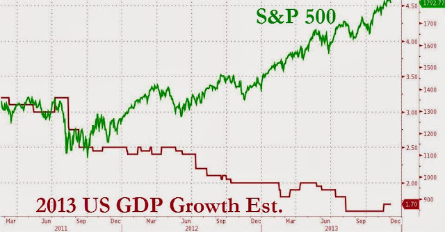
Seth Mason Charleston SC blog 13Here's some compelling evidence that the Federal Reserve is looking out for Wall Street investors instead of the Main Street economy: S&P and GDP expectations have been inversely proportional since the Fed announced "Operation Twist" (a bond buying scheme) in October, 2011. As you can see on this chart from Bloomberg, Operation Twist has greatly benefited those whose incomes are strongly tied to the market. But, for the tens of millions of middle class Americans who were unfortunate enough to lose their financial standing after the bursting of the Fed's housing bubble, economic prospects haven't been looking so good.

Evidence That The Fed Prints For Wall Street - S&P vs. GDP

On the other hand, the Fed's liquidity pumping has juiced the stock market like crazy throughout this economic depression. Every time the Fed has either announced or implemented a new liquidity pumping scheme, the market has risen. Every time one of the Fed's schemes has ended, the market has declined. The economy simply hasn't been strong enough to support the market without the Fed's help. But these actions aren't indefinitely sustainable, and they certainly aren't without long-term consequences.

Evidence That The Fed Prints For Wall Street - S&P and QE

Tuesday, April 30, 2013

The New, Bigger Housing Bubble In 4 Charts

Seth Mason Charleston SC blog 22
Federal Reserve Chairman Ben Bernanke's "solution" to the country's economic woes, a new, even larger asset bubble, is becoming evident in several sectors of the economy, from equities to real estate. The following charts suggest that the bubble the Fed is inflating in the housing market will eclipse the last one, which was big enough to plunge the country into an economic depression when it burst.

First, the year-over-year increase in home prices since 2008 has been steeper than the YoY during the last housing bubble:

The New, Bigger Housing Bubble In 4 Charts - Home Prices Chart


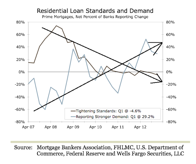
Second, the inversely proportional decrease in mortgage standards and increase in demand for mortgages has been starker than it was during the last bubble:

The New, Bigger Housing Bubble In 4 Charts - Mortgage Demand Chart


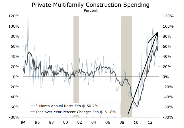
Third, apartment and condo starts have been skyrocketing at a rate far eclipsing that of the last bubble:

The New, Bigger Housing Bubble In 4 Charts - Multifamily Construction Chart


Fourth, investors are throwing cheap, Fed-provided money at housing at a rate far exceeding that of the last bubble:

The New, Bigger Housing Bubble In 4 Charts - Residential Investment Chart

Tuesday, April 23, 2013

Fed Liquidity Pumping Good For Wealthy, Bad For Rest

Seth Mason Charleston SC blog 25The premise is simple: the wealthy have a disproportionate amount of their net worth in investments, and the Fed has been propping up the stock market and inflating asset bubbles. Therefore, the price inflation-driven economic recovery has been robust for the richest 7% and weak to non-existent for everyone else. And never forget, wealth and exposure to inflation are inversely-proportional. In other words, those with less money spend a greater percentage of their incomes on essentials--food, energy, etc.--whose prices have been rising as a result of the asset bubble. From Pew Research:
During the first two years of the nation’s economic recovery, the mean net worth of households in the upper 7% of the wealth distribution rose by an estimated 28%, while the mean net worth of households in the lower 93% dropped by 4%, according to a Pew Research Center analysis of newly released Census Bureau data.

Fed Liquidity Pumping Good For Wealthy, Bad For Rest- Change In Net WorthFrom 2009 to 2011, the mean wealth of the 8 million households in the more affluent group rose to an estimated $3,173,895 from an estimated $2,476,244, while the mean wealth of the 111 million households in the less affluent group fell to an estimated $133,817 from an estimated $139,896.

These wide variances were driven by the fact that the stock and bond market rallied during the 2009 to 2011 period while the housing market remained flat.

Affluent households typically have their assets concentrated in stocks and other financial holdings, while less affluent households typically have their wealth more heavily concentrated in the value of their home.

From the end of the recession in 2009 through 2011 (the last year for which Census Bureau wealth data are available), the 8 million households in the U.S. with a net worth above $836,033 saw their aggregate wealth rise by an estimated $5.6 trillion, while the 111 million households with a net worth at or below that level saw their aggregate wealth decline by an estimated $0.6 trillion.1
Fed Liquidity Pumping Good For Wealthy, Bad For Rest - Household Net Worth
Because of these differences, wealth inequality increased during the first two years of the recovery. The upper 7% of households saw their aggregate share of the nation’s overall household wealth pie rise to 63% in 2011, up from 56% in 2009. On an individual household basis, the mean wealth of households in this more affluent group was almost 24 times that of those in the less affluent group in 2011. At the start of the recovery in 2009, that ratio had been less than 18-to-1.
(The focus in this report on the upper 7% of households rather than some other share of high wealth households reflects the limits of the tabulations published by the Census Bureau. The boundaries of its wealth categories dictated the split of households analyzed in this report.)

Overall, the wealth of America’s households rose by $5 trillion, or 14%, during this period, from $35.2 trillion in 2009 to $40.2 trillion in 2011.2 Household wealth is the sum of all assets, such as a home, car, real property, a 401(k), stocks and other financial holdings, minus the sum of all debts, such as a mortgage, car loan, credit card debt and student loans.

During the period under study, the S&P 500 rose by 34% (and has since risen by an additional 26%), while the S&P/Case-Shiller home price index fell by 5%, continuing a steep slide that began with the crash of the housing market in 2006. (Housing prices have slowly started to rebound in the past year but remain 29% below their 2006 peak.)
The different performance of financial asset and housing markets from 2009 to 2011 explains virtually all of the variances in the trajectories of wealth holdings among affluent and less affluent households during this period. Among households with net worth of $500,000 or more, 65% of their wealth comes from financial holdings, such as stocks, bonds and 401(k) accounts, and 17% comes from their home. Among households with net worth of less than $500,000, just 33% of their wealth comes from financial assets and 50% comes from their home.

Fed Liquidity Pumping Good For Wealthy, Bad For Rest - Change In Assets

The Census Bureau data also indicate that among less affluent households, fewer directly owned stocks and mutual fund shares in 2011 (13%) than in 2009 (16%), meaning a smaller share enjoyed the fruits of the stock market rally. Likewise, fewer had individual retirement accounts (IRAs) or Keogh accounts (22% in 2011 versus 24% in 2009) and the same share had 401(k) or Thrift Savings Plan accounts (39% in both years). Among affluent households, there was also a decline in the share directly owning stock and mutual fund shares during this period (59% in 2011 versus 62% in 2009), but a slight increase in the share with IRAs or Keogh accounts (70% versus 68%) and a larger increase in the share with 401(k) or Thrift Savings Plan accounts (65% versus 61%).

Overall, net worth per household in the U.S. in 2011 made up nearly all the ground it had lost since 2005—$338,950 versus $340,252 in 2005, the latest pre-recession data published by the Census Bureau. (Total household wealth doubtless rose for a period after 2005 before falling precipitously during the Great Recession of 2007-2009 and rebounding since then. However, no household wealth data are available from the Census Bureau for the years between 2005 and 2009, so it is not possible to pinpoint when, or at what level, the peak in wealth per household occurred.)

Looking at the period from 2005 to 2009, Census Bureau data show that mean net worth declined by 12% for households as a whole but remained unchanged for households with a net worth of $500,000 and over. Households in that top wealth category had a mean of $1,590,075 in wealth in 2005, $1,585,441 in 2009 and $1,920,956 in 2011.3

Seth Mason, Charleston SC

Sunday, March 31, 2013

Keynesian-Monetarist Economist: Fed Responsible For High Unemployment

Seth Mason Charleston SC blog 30Keynesian-Monetarist Stanford economist John B. Tayor, an advocate of heavy Fed intervention in the economy, has come to believe that the Fed's ultra-loose monetary policy was responsible for the 2008 economic implosion and the subsequent protracted period of high unemployment. Furthermore, he believes that the Fed's "solution" to the economic depression and high unemployment we've experienced over the past 5 years, massive money printing and record-low interest rates, will ultimately result in additional harm to the economy and even more unemployment:
What's your assessment of the Federal Reserve's recent actions to help spur the economy? 

The Fed has engaged in extraordinarily loose monetary policy, including two rounds of so-called quantitative easing.

These large-scale purchases of mortgages and Treasury debt were aimed at lifting the value of those securities, thereby bringing down interest rates. I believe quantitative easing has been ineffective at best and potentially harmful.

Harmful how?
 
The Fed has effectively replaced large segments of the market with itself -- it bought 77% of new federal debt in 2011, my calculations show. By doing so, the Fed has created great uncertainty about the impact of its actions on inflation, the dollar, and the economy.
The existence of quantitative easing as a policy tool creates uncertainty, as traders speculate on whether and when the Fed is going to intervene. It's bad for the U.S. stock market, which should reflect the earnings of corporations.

You believe the Fed's mission needs to be changed.
 
The Fed needs to focus on a single goal of long-run price stability. We should remove the Fed's dual mandate of maximum employment and stable prices, which was put into effect in the 1970s.

From 2003 to 2005, the Fed held interest rates too low for too long. A primary reason was its concern that raising rates would increase unemployment.

The unintended consequence was that low rates fueled the housing bubble, which in turn led to the recession and high unemployment.

More recently, the Fed has cited concerns over employment to justify its interventions, including quantitative easing. Removing the dual mandate would take away that excuse.
That came from a Keynesian!

Seth Mason, Charleston SC

Monday, January 7, 2013

The Definitive Inflation Chart

Seth Mason Charleston SC blog 36There are several takeaways from this chart: 1) Inflation was essentially non-existent until the creation of the Federal Reserve in 1913. 2) War, which requires massive government spending, promotes inflation. 3) Inflation has skyrocketed since Nixon took us off the gold standard in 1971, which gave the Fed a carte blanche to print. 4) Bernanke's concern about deflation is unfounded. See that tiny break in the inflation trendline above the "Great Recession arrow"? That's the deflation he's concerned about.
The Definitive Inflation Chart - historical CPI chart


Just for giggles, let's compare that last chart with a chart of the national debt:

The Definitive Inflation Chart - national debt chart


Is it clear enough that the Fed enables deficit spending?

Seth Mason, Charleston SC