Showing posts with label liquidity pumping. Show all posts

Tuesday, March 4, 2014

The Post-1990s Federal Reserve: Enemy Of The Middle Class

Seth Mason Charleston SC blog 6One need not delve into hardcore economic research to reach the conclusion that the Fed is largely responsible for our country's economic woes. One need only have common sense and possess the ability to read charts.

In the mid-1990s, Alan Greenspan's Fed began our central bank's tradition of pumping massive amounts of liquidity. Since that time, stocks and other assets typically held in large quantities by the wealthy have done--for the most part--very well. But, for middle class Americans, who rely on "breadwinner" jobs for their livelihoods, the past 15 or so years have been a period of economic decline, the past 6 years a period of economic free-fall.

Since peaking at around 67.5% in the late 1990s, the labor force participation rate has declined to 63%, the lowest level since the 1970s, when households rarely sent more than one member into the workforce. The S&P 500, on the other hand, has more than doubled:

The Post-1990s Fed: Enemy Of The Middle Class - Labor Force Participation vs. Stocks

Corporate profits and labor force participation also decoupled in the late 1990s. Today, there is little correlation between the two:

The Post-1990s Fed: Enemy Of The Middle Class - Labor Force Participation vs. Corporate Profits


What's more, part-time jobs have been replacing full-time jobs since the Fed's tech bubble:

The Post-1990s Fed: Enemy Of The Middle Class - Part Time vs. Full Time Jobs


And, since the late 1990s, real wages (adjusted for inflation) have been in decline:

The Post-1990s Fed: Enemy Of The Middle Class - Annual Change In Real Wages

Wednesday, December 4, 2013

Evidence That The Fed Prints For Wall Street (Not Main Street)

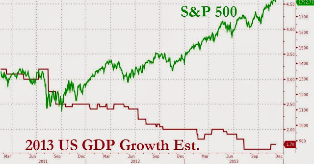
Seth Mason Charleston SC blog 13Here's some compelling evidence that the Federal Reserve is looking out for Wall Street investors instead of the Main Street economy: S&P and GDP expectations have been inversely proportional since the Fed announced "Operation Twist" (a bond buying scheme) in October, 2011. As you can see on this chart from Bloomberg, Operation Twist has greatly benefited those whose incomes are strongly tied to the market. But, for the tens of millions of middle class Americans who were unfortunate enough to lose their financial standing after the bursting of the Fed's housing bubble, economic prospects haven't been looking so good.

Evidence That The Fed Prints For Wall Street - S&P vs. GDP

On the other hand, the Fed's liquidity pumping has juiced the stock market like crazy throughout this economic depression. Every time the Fed has either announced or implemented a new liquidity pumping scheme, the market has risen. Every time one of the Fed's schemes has ended, the market has declined. The economy simply hasn't been strong enough to support the market without the Fed's help. But these actions aren't indefinitely sustainable, and they certainly aren't without long-term consequences.

Evidence That The Fed Prints For Wall Street - S&P and QE

Tuesday, April 23, 2013

Fed Liquidity Pumping Good For Wealthy, Bad For Rest

Seth Mason Charleston SC blog 25The premise is simple: the wealthy have a disproportionate amount of their net worth in investments, and the Fed has been propping up the stock market and inflating asset bubbles. Therefore, the price inflation-driven economic recovery has been robust for the richest 7% and weak to non-existent for everyone else. And never forget, wealth and exposure to inflation are inversely-proportional. In other words, those with less money spend a greater percentage of their incomes on essentials--food, energy, etc.--whose prices have been rising as a result of the asset bubble. From Pew Research:
During the first two years of the nation’s economic recovery, the mean net worth of households in the upper 7% of the wealth distribution rose by an estimated 28%, while the mean net worth of households in the lower 93% dropped by 4%, according to a Pew Research Center analysis of newly released Census Bureau data.

Fed Liquidity Pumping Good For Wealthy, Bad For Rest- Change In Net WorthFrom 2009 to 2011, the mean wealth of the 8 million households in the more affluent group rose to an estimated $3,173,895 from an estimated $2,476,244, while the mean wealth of the 111 million households in the less affluent group fell to an estimated $133,817 from an estimated $139,896.

These wide variances were driven by the fact that the stock and bond market rallied during the 2009 to 2011 period while the housing market remained flat.

Affluent households typically have their assets concentrated in stocks and other financial holdings, while less affluent households typically have their wealth more heavily concentrated in the value of their home.

From the end of the recession in 2009 through 2011 (the last year for which Census Bureau wealth data are available), the 8 million households in the U.S. with a net worth above $836,033 saw their aggregate wealth rise by an estimated $5.6 trillion, while the 111 million households with a net worth at or below that level saw their aggregate wealth decline by an estimated $0.6 trillion.1
Fed Liquidity Pumping Good For Wealthy, Bad For Rest - Household Net Worth
Because of these differences, wealth inequality increased during the first two years of the recovery. The upper 7% of households saw their aggregate share of the nation’s overall household wealth pie rise to 63% in 2011, up from 56% in 2009. On an individual household basis, the mean wealth of households in this more affluent group was almost 24 times that of those in the less affluent group in 2011. At the start of the recovery in 2009, that ratio had been less than 18-to-1.
(The focus in this report on the upper 7% of households rather than some other share of high wealth households reflects the limits of the tabulations published by the Census Bureau. The boundaries of its wealth categories dictated the split of households analyzed in this report.)

Overall, the wealth of America’s households rose by $5 trillion, or 14%, during this period, from $35.2 trillion in 2009 to $40.2 trillion in 2011.2 Household wealth is the sum of all assets, such as a home, car, real property, a 401(k), stocks and other financial holdings, minus the sum of all debts, such as a mortgage, car loan, credit card debt and student loans.

During the period under study, the S&P 500 rose by 34% (and has since risen by an additional 26%), while the S&P/Case-Shiller home price index fell by 5%, continuing a steep slide that began with the crash of the housing market in 2006. (Housing prices have slowly started to rebound in the past year but remain 29% below their 2006 peak.)
The different performance of financial asset and housing markets from 2009 to 2011 explains virtually all of the variances in the trajectories of wealth holdings among affluent and less affluent households during this period. Among households with net worth of $500,000 or more, 65% of their wealth comes from financial holdings, such as stocks, bonds and 401(k) accounts, and 17% comes from their home. Among households with net worth of less than $500,000, just 33% of their wealth comes from financial assets and 50% comes from their home.

Fed Liquidity Pumping Good For Wealthy, Bad For Rest - Change In Assets

The Census Bureau data also indicate that among less affluent households, fewer directly owned stocks and mutual fund shares in 2011 (13%) than in 2009 (16%), meaning a smaller share enjoyed the fruits of the stock market rally. Likewise, fewer had individual retirement accounts (IRAs) or Keogh accounts (22% in 2011 versus 24% in 2009) and the same share had 401(k) or Thrift Savings Plan accounts (39% in both years). Among affluent households, there was also a decline in the share directly owning stock and mutual fund shares during this period (59% in 2011 versus 62% in 2009), but a slight increase in the share with IRAs or Keogh accounts (70% versus 68%) and a larger increase in the share with 401(k) or Thrift Savings Plan accounts (65% versus 61%).

Overall, net worth per household in the U.S. in 2011 made up nearly all the ground it had lost since 2005—$338,950 versus $340,252 in 2005, the latest pre-recession data published by the Census Bureau. (Total household wealth doubtless rose for a period after 2005 before falling precipitously during the Great Recession of 2007-2009 and rebounding since then. However, no household wealth data are available from the Census Bureau for the years between 2005 and 2009, so it is not possible to pinpoint when, or at what level, the peak in wealth per household occurred.)

Looking at the period from 2005 to 2009, Census Bureau data show that mean net worth declined by 12% for households as a whole but remained unchanged for households with a net worth of $500,000 and over. Households in that top wealth category had a mean of $1,590,075 in wealth in 2005, $1,585,441 in 2009 and $1,920,956 in 2011.3

Seth Mason, Charleston SC

Monday, January 7, 2013

The Definitive Inflation Chart

Seth Mason Charleston SC blog 36There are several takeaways from this chart: 1) Inflation was essentially non-existent until the creation of the Federal Reserve in 1913. 2) War, which requires massive government spending, promotes inflation. 3) Inflation has skyrocketed since Nixon took us off the gold standard in 1971, which gave the Fed a carte blanche to print. 4) Bernanke's concern about deflation is unfounded. See that tiny break in the inflation trendline above the "Great Recession arrow"? That's the deflation he's concerned about.
The Definitive Inflation Chart - historical CPI chart


Just for giggles, let's compare that last chart with a chart of the national debt:

The Definitive Inflation Chart - national debt chart


Is it clear enough that the Fed enables deficit spending?

Seth Mason, Charleston SC

Thursday, November 29, 2012

U.S. Share Of World GDP Has Fallen 32% Since 2001

Seth Mason Charleston SC blog 37
Mark McHugh of Across the Street outlines America's economic decline--in both real terms and relative to the rest of the world:

The Cost of Kidding Yourself

In Open Thread on Wednesday, November 28, 2012 at 1:34 pm 
Five years ago, every American would have considered a trillion-dollar budget deficit a national tragedy.  If you believe the CNBC parrot show, NOT having a trillion-dollar deficit is now a sure sign of the Apocalypse.  I speak of course of the cleverly dubbed “Fiscal Cliff,” which panicked CNBC apologists are required to mention no less than 5,000 times a day.  We’re told ad nauseam that going over the cliff will drag the US into recession.  Here’s what we’re not told: The US has been in recession 9 of the last 10 years.  It’s in recession this year, and no matter what CNBC’s financial terrorists say or the idiots on Capital Hill decide, it will most certainly be in recession in 2013.
Creating the illusion of economic growth is easy if you can print money.  It’s a prank you can play on an entire country.  Cut the value of the currency in half and the economy’s size will appear to double.  If it doesn’t, you’re in recession (whether you know it or not).   Cavemen probably understood this concept better than America’s best economic minds.
The only way to accurately measure changes in a nation’s economy is to do so relative to the world (see Notes for non-nerds below before protesting).  According to the World Bank, the U.S. represented 31.8% of the world’s economic activity in 2001. By the end of 2011, that share had dropped to 21.6%, meaning America’s slice of the world economy is 32% smaller than it was a decade ago, and getting smaller every day.  Note that America’s housing bubble did nothing to boost the U.S. on the global stage.
As horrific as these results are, they’re better than Japan’s, whose “lost decade” proved only to be prologue for its “lost-er decade.”  Japan’s share of the world economy fell more than 35% from 2001 to 2011 (literally worse than Zimbabwe) and has now shriveled 54% from its peak.  But Japan’s real collapse did not coincide with the bursting of its stock and real estate bubbles in 1990 and 1991 respectively.  The decline actually began in 1995 when policymakers allowed government debt to exceed 90% of GDP (a milestone the U.S. quietly passed in 2010). 

The more they “fixed” it, the more it broke.  17 years later, the only thing Japan has proved is that smart Japanese economists are about as real as Godzilla.  Time and time again, the country has chosen collapse over admitting failure. On November 19, 2012, Bloomberg reported, “The Japanese government will spend 1 trillion yen ($12.3B) on a second round of fiscal stimulus as it tries to revive an economy at risk of sliding into recession.”  It would be funny if it wasn’t so tragic.
The United Kingdom gets third place in the 2001-2011 major economies’ “Race to Oblivion”, although with a less than 3.5% share of world GDP it’s hard to call this a major economy with a straight face anymore.  While the U.K. printed its way to 24% loss in world GDP, France and Brazil both passed the nation where an actual troy pound of sterling silver now costs about 235 “pounds sterling”.  With government debt expected to reach 88.7% of GDP in 2012, once-Great Britain will soon be seated at the kids’ table at economic summits, if it gets invited at all.
All three of these countries are in death spirals for the same reason:  They believe that they have the ability to avoid recession by simply printing their own money.  As America’s 100-year numbskull (and current Federal Reserve Chairman) Ben Bernanke once mused:
“…the U.S. government has a technology, called a printing press (or, today, its electronic equivalent), that allows it to produce as many U.S. dollars as it wishes at essentially no cost.”
True dat, Ben….unless there’s “cost” associated with turning the nation’s currency into the world’s laughing stock….
Oh wait, there is.  So just for fun, let’s project the last ten years growth rates forward another ten years:

And there you have the real New World Order (sorry Freemasons).  In ten years China’s economy will be bigger than those of the U.S., Japan, and the U.K. combined.  What are the chances they will drink the same kool-aid we are presently guzzling?  Will they need, or even tolerate, the opinions spewed by our pundits and politicians?  And more importantly, will the U.S. dollar still be the world’s reserve currency?
Being a war-mongering banana republic isn’t all it’s cracked up to be, and despite what CNBC’s fast-money fuckwits may think, the stock market is not America’s report card.  Wall Street is the white elephant that America can’t afford to feed anymore and China doesn’t have the slightest interest in buying (just take a look at the Shanghai Composite).   Continuing to yield to its tantrums will undoubtedly destroy us.
Fun Facts:  Total U.S. GDP growth in the 20th century was $9.93 Trillion, while the  government accumulated $5.5 Trillion in debt.  In the 21st century, the US has borrowed $10.7T and has a grand total of $5.30T in GDP growth.
***
Notes for nerds: Most of the calculations presented were derived from data compiled by the World Bank which can be viewed or downloaded here.   World GDP was set to 100% and each country’s percentage determined simply by dividing by world GDP.   Japan’s debt as a percentage of GDP from Fred (225% was used for 2011).  Estimate of U.K.’s 2012 Debt/GDP from here.  U.S. GDP stats from USgovernmentspending.com (2012 estimate adjusted for 2% growth).  US debt from Debt to the Penny.
Notes for non-nerds:  How much World GDP changes from one year to the next depends entirely on what is being used to measure it.  For example, World GDP expanded by 109% from 2002 to 2011 in USD terms, but contracted (-59%) in terms of gold.  Using the Euro would produce different results (+59%), as would using barrels of oil (you figure it out).  Looking at countries relative to World GDP is an honest measure of their changes.  To say that Japan is still growing (at least in terms of Yen), but everyone else is growing much, much faster in terms of Yen distorts the reality that  Japan is undeniably shrinking relative to the world (no matter what currency is used).
 Seth Mason, Charleston SC